
ABC Analysis for Inventory: Put Your Control Where the Value Is
ABC analysis sorts every SKU into three classes by annual usage value, so the stock that ties up most of your cash gets most of your attention and the long tail gets left alone. Here's how to rank the lines, where to draw the A/B/C cut-offs, and what you actually do differently for each class once you have.
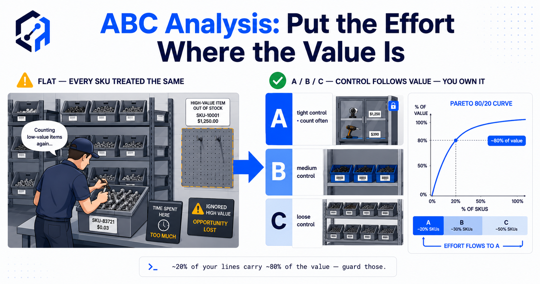
ABC analysis for inventory groups stock into A, B and C classes using a defined ranking measure, so control effort follows the items that matter most under that measure. A common approach uses annual usage value: the quantity sold or consumed over a period multiplied by an appropriate unit cost. Rank the items, calculate their cumulative share of value and choose workable class boundaries.
The method helps a team prioritise counting, purchasing review and supplier attention. It does not directly calculate a reorder point, prove physical stock accuracy or identify every business-critical item. A low-value component can still stop production, so financial ranking needs an explicit criticality review.
This guide explains the calculation, a transparent example and the decisions that should follow it. The useful result is a policy your team can apply, rather than a spreadsheet coloured into three bands and then forgotten.

ABC analysis prioritises attention across a catalogue; it does not remove the need to control lower-value stock.
Key Takeaways
- Define the ranking measure first. Annual usage value, on-hand value and movement frequency answer different questions.
- Usage value depends on quantity and cost, rather than unit price alone.
- A, B and C thresholds are policy choices. An 80/15/5 split is an illustrative starting point, not a universal distribution.
- Usage value is not the cash currently tied up on the shelf. Analyse on-hand value separately where that is the question.
- Review criticality, lead time, expiry and stockout consequences, especially for items with low financial rank.
- Connect classes to specific actions and review dates, with approved exceptions and clear ownership.
In this guide:
- 1. Define What the Classification Measures
- 2. Prepare Quantities, Costs and the Review Period
- 3. Calculate and Assign the Classes
- 4. Translate Class A into Practical Controls
- 5. Set Proportionate Policies for B and C
- 6. Add Criticality and Demand Behaviour
- 7. Review Class Changes and Connect the Workflow
- 8. Pilot the Policy and Measure the Result
- Frequently Asked Questions
- How OpsMavix Can Help
1. Define What the Classification Measures
Start with the decision
If the goal is to prioritise high-value purchasing and consumption, usage value can be useful. If the goal is to review capital held in stock today, on-hand quantity and valuation are more directly relevant.
If the goal is counting, financial exposure matters, but transaction frequency and discrepancy history may also influence the schedule. Keep those measures separate so users understand why an item receives attention.
| Measure | What it describes | Useful question |
|---|---|---|
| Usage value | Value of quantities sold or consumed during a defined period | Which items account for most value flowing through the operation? |
| On-hand value | Value of stock held at a point in time | Where is inventory capital currently concentrated? |
| Movement frequency | Number of defined stock transactions | Which records are touched most often? |
| Unit cost | Cost per stock unit | What is the financial exposure of a one-unit error? |
| Criticality | Consequence of an item being unavailable | Which shortages could interrupt an essential activity? |
Avoid treating the measures as interchangeable
A £900 spare used twice a year has £1,800 annual usage value under a constant-cost model. A £2 component consumed 10,000 times has £20,000. The cheaper component ranks higher by usage value.
That does not show which item holds more cash today. If 30 spares are on hand and 100 components remain, the stock-value comparison is very different.
Use a documented basis
Oracle’s usage quantity and usage value guidance distinguishes ranking by historical quantity from ranking by historical transaction value. That distinction is useful regardless of the tool used.
Record the period, transaction scope and cost basis with the classification. A label without those definitions is difficult to interpret later.
2. Prepare Quantities, Costs and the Review Period
Use consistent units
Purchasing in cases and consuming individual units can distort the calculation if quantities and costs use different bases. Convert to an agreed stock unit before multiplying.
Confirm that product variants and duplicate codes are represented consistently. Combining unrelated products can produce a high-value line whose control policy makes no operational sense.
Choose a representative period
A complete year can include a full seasonal cycle, but it may also include a discontinued product or a one-off project. A shorter period may reflect recent change while missing seasonal demand.
Use the period that supports the decision and flag exceptional activity. For a new product without enough history, use an explicitly labelled provisional policy rather than allowing zero recorded usage to imply low importance.
Explain how cost changes are handled
A simple spreadsheet may use total annual quantity multiplied by one selected unit cost. A transaction-based system may sum quantity multiplied by the applicable cost for each transaction.
Neither figure should be presented as interchangeable without checking the basis. Use the cost definition approved for the analysis and retain it for repeatability.
Before ranking, check:
- Missing or zero costs.
- Duplicate and inactive product records.
- Incorrect units of measure.
- Returns and reversals included inconsistently.
- Internal transfers counted as consumption twice.
- Unusual project or launch demand.
- Incomplete historical transaction coverage.
The classification cannot repair unreliable source data. Keep exceptions visible rather than allowing them to disappear into C.
3. Calculate and Assign the Classes
Rank usage value from highest to lowest
For a simple constant-cost model:
Period usage value = units used during the period × selected unit cost.
Calculate each item’s share of the total, then a cumulative share down the sorted list. Select class boundaries based on that curve and the workload the policies create.
Work through a transparent example
Hypothetical annual example: all quantities use the same stock-unit basis, and each line uses a constant illustrative cost.
| Item | Annual units | Unit cost | Usage value | Share | Cumulative share |
|---|---|---|---|---|---|
| P1 | 2,000 | £25 | £50,000 | 50% | 50% |
| P2 | 3,000 | £10 | £30,000 | 30% | 80% |
| P3 | 1,000 | £10 | £10,000 | 10% | 90% |
| P4 | 1,000 | £5 | £5,000 | 5% | 95% |
| P5 | 2,000 | £2 | £4,000 | 4% | 99% |
| P6 | 1,000 | £1 | £1,000 | 1% | 100% |
| Total | £100,000 | 100% |
An illustrative policy assigns P1 and P2 to A, P3 and P4 to B, and P5 and P6 to C. Here A contains two of six items and 80% of usage value. The item share is about 33%, showing why the familiar 80/20 pattern is not a required outcome.
Define the boundary rule
A single item may cross a threshold. Decide whether the item that takes cumulative value over the boundary stays in the higher class or moves to the next. Apply that convention consistently and record it.
Do not split a SKU merely to force an exact percentage. The objective is a usable item policy, not a visually perfect distribution.
4. Translate Class A into Practical Controls
Increase review where the exposure justifies it
Class A may warrant more frequent stock verification, closer review of open orders and more deliberate supplier follow-up. Assign owners and define the action, rather than simply displaying a red or green badge.
For example, a buyer might review overdue A receipts weekly and escalate unresolved discrepancies. The cadence is a local policy, not a property automatically implied by the letter A.
Keep replenishment calculations separate
ABC does not tell you the demand during lead time or the buffer required for uncertainty. Reorder points and safety stock need their own demand, lead-time and service assumptions.
A high-usage-value item may need a small buffer if supply is dependable, while a low-value essential component may need stronger protection. Avoid applying the same buffer multiplier to every member of a class without testing it.
Use counts to investigate discrepancies
Our ABC cycle counting guide applies classification to verification effort. A count result should lead to a reviewed correction and an investigation proportionate to the discrepancy.
Frequent counting can detect drift earlier. It cannot guarantee that A quantities remain accurate between counts if receipts, issues or returns are still missed.
5. Set Proportionate Policies for B and C
Give B an explicit routine
B is not a holding area for items nobody owns. Define a moderate review and count cadence, and identify what would trigger additional attention.
An item approaching A may need buyer review before the next planned classification refresh. An item declining towards C may need a demand or obsolescence assessment rather than simply less attention.
Simplify C without ignoring it
Low financial rank can justify simpler purchasing or less frequent routine counting, provided the consequences are acceptable. It does not justify unrecorded movements or leaving discrepancies unexplained.
Bulk ordering can reduce administration but may increase storage, expiry and obsolete stock. Compare those costs before deciding that C automatically means buying a large buffer.
| Class | Example policy direction | Decision still required |
|---|---|---|
| A | Closer review of supply, discrepancies and exposure | Demand, lead time and service requirements |
| B | Regular planned review with exception triggers | Promotion, decline and unusual activity |
| C | Simpler administration and proportionate routine checks | Criticality, expiry and storage cost |
These are directions for a policy, not universal settings.
Keep core controls common
All classes still need clear product identity, authorised movements and a way to resolve errors. Financial priority changes review effort; it should not remove basic recordkeeping.
If a small, uniform catalogue has little meaningful variation, a single practical policy may be simpler than maintaining three classes. Use ABC where differentiation supports an actual decision.
6. Add Criticality and Demand Behaviour
Identify low-value items with high consequences
A cheap seal, label or fastener can prevent a finished product being shipped. Its low annual usage value does not describe that interruption risk.
Maintain a separate criticality flag with a reason and owner. It can override count frequency or purchasing review without changing the meaning of the financial ABC class.
Distinguish steady from intermittent demand
Two items can have identical annual usage value but different demand patterns. One moves every day; another is consumed in one large project.
Review variation, seasonality and known future requirements before choosing a replenishment policy. A historical rank is not a forecast and does not guarantee next year’s demand.
Keep other constraints visible
Expiry, long lead time, supplier concentration, customer commitments and substitution options may change how an item is managed. Record these as explicit attributes or exceptions.
A useful working view might show “C by usage value, critical component, six-week lead time”. That is more informative than silently promoting it to A and losing the explanation.
7. Review Class Changes and Connect the Workflow
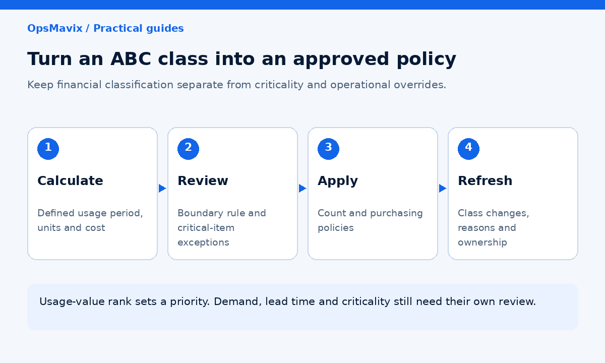
Connect classification changes to review tasks, count schedules and approved purchasing policies.
Choose a review cadence that users can maintain
Monthly or quarterly review may be suitable for some operations; fast-changing catalogues may need more frequent analysis. Stable catalogues may need a different cadence. Define event triggers for launches, major cost changes and discontinued products.
Continuous calculation is possible, but continuously changing operational policies can create confusion near a boundary. Separate refreshed analysis from approved policy changes where necessary.
Keep a history of why the class changed
Store the previous class, new class, period, cost basis and change date. Show whether a movement came from increased demand, higher cost or corrected source data.
A sudden jump caused by a unit-conversion error needs data correction, not an immediate increase in purchasing.
Start with the current tool
A controlled spreadsheet may be sufficient to establish the method. Inventory software may already support classifications and count policies. A connection or focused development can help where the calculation exists but the operational actions remain manual.
Compare configuration, integration and custom development against the demonstrated gap. A full ERP can also be appropriate where the wider inventory, production and finance processes need redesign.
8. Pilot the Policy and Measure the Result
Use a manageable catalogue subset
Choose items with different values and behaviours. Include a critical low-value item, a seasonal product, a new launch and an item with corrected cost data.
Reconcile the calculation to known transaction records. Ask the buyer and warehouse team whether the resulting priorities match the decisions they actually need to make.
Write acceptance checks
The pilot should demonstrate that:
- Quantities and costs share an agreed unit basis.
- Usage value reconciles to the selected period and transactions.
- Class boundaries and crossing-item rules are reproducible.
- Critical items receive the agreed exception policy.
- Counts and purchasing reviews use the approved class.
- New and inactive products follow a defined route.
- Class changes retain reasons and history.
- Missing or failed data updates remain visible.
Measure useful outcomes
Track overdue reviews, unresolved A discrepancies, count completion and time spent maintaining the classification. Assess service outcomes alongside inventory exposure rather than assuming fewer review hours automatically means better control.
Use baseline and pilot evidence to decide whether automation is justified. Released staff capacity is not automatically a cash saving, and usage-value concentration is not proof of avoidable stock loss.
Expand when the team can explain each class and the action attached to it.
Frequently Asked Questions
What is ABC analysis in inventory?
It classifies items into groups using a defined ranking measure, commonly annual usage value. The classes help prioritise review, counting and purchasing attention.
How do I calculate annual usage value?
In a simple model, multiply annual units used or sold by the selected unit cost. A transaction-based model can sum quantity multiplied by the applicable cost for each transaction. Document the basis used.
Are A items always 20% of the catalogue?
No. The distribution depends on the catalogue and class boundaries. The familiar 80/20 pattern is a heuristic, not a required result.
Does ABC show cash tied up in stock?
Usage-value ABC describes value flowing through the operation over a period. Current inventory capital requires an on-hand quantity and valuation analysis.
Should Class C stock be ignored?
No. It still needs accurate identity, recorded movements and appropriate controls. Lower financial rank may justify simpler review, subject to criticality and other constraints.
Is ABC a reorder-point calculation?
No. It sets priorities. Reorder points and safety stock depend on demand, lead time, uncertainty and the service policy.
Can a critical item remain financially C?
Yes. Keep the financial class and a separate criticality flag. Apply an explicit override where the consequence of shortage warrants additional control.
How often should classes be refreshed?
Use a cadence suited to change in the catalogue and the decisions involved. Define event triggers and avoid unreviewed policy changes caused by minor boundary movements.
Do we need custom software?
Not necessarily. Establish the calculation and policies first, then test existing spreadsheet or inventory capabilities. Automate a demonstrated gap rather than building around labels alone.
How OpsMavix Can Help
OpsMavix builds inventory systems that connect product records, movement history and practical control policies.
We assess the existing data and tools, define the classification basis, and connect approved classes to counting and purchasing reviews where useful. The scope can be a focused workflow or part of a full ERP.
OpsMavix can help you:
- Reconcile quantities, units and cost definitions.
- Calculate reproducible classifications.
- Maintain criticality and other policy exceptions.
- Surface class changes for review.
- Connect count schedules and purchasing attention.
- Measure the pilot and plan a maintainable handover.
If effort is spread evenly while important items remain poorly controlled, book an Operations Leak Audit. Bring a representative stock list and one recent discrepancy so we can map the priority and data gaps.
Keep reading
Getting value from OpsMavix? Add us as a preferred source on Google — you'll see more of our operations content in your AI Overviews, AI Mode and Search.